Before & After Section
Visual Design
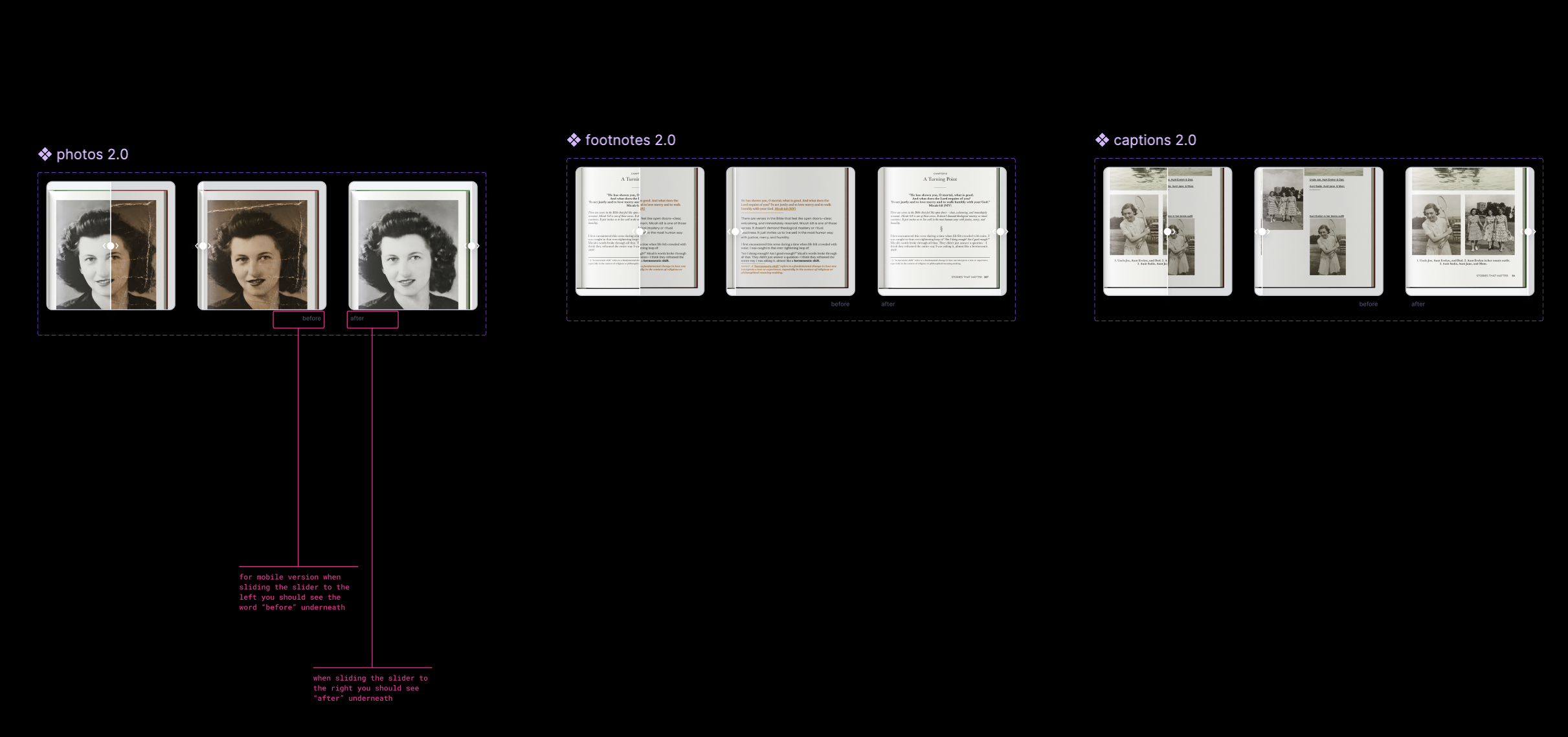
Once the wireframe was set I began to brainstorm different ways the before/after section might operate in mobile. It was clear that the section was going to be a carousel comparison for the desktop version but when thinking of mobile we had to brainstorm a way that the user would be able to notice a clear difference and still be able to compare the before/after to each other one after the other.
I collaborated with stakeholders, my design manager, the marketing lead, and stakeholders to deliver a responsive section that highlights the value of My Stories Matter.


Overview
My Stories Matter is a digital storytelling platform that empowers users to upload their personal memories and transform them into beautifully formatted hardcover books.
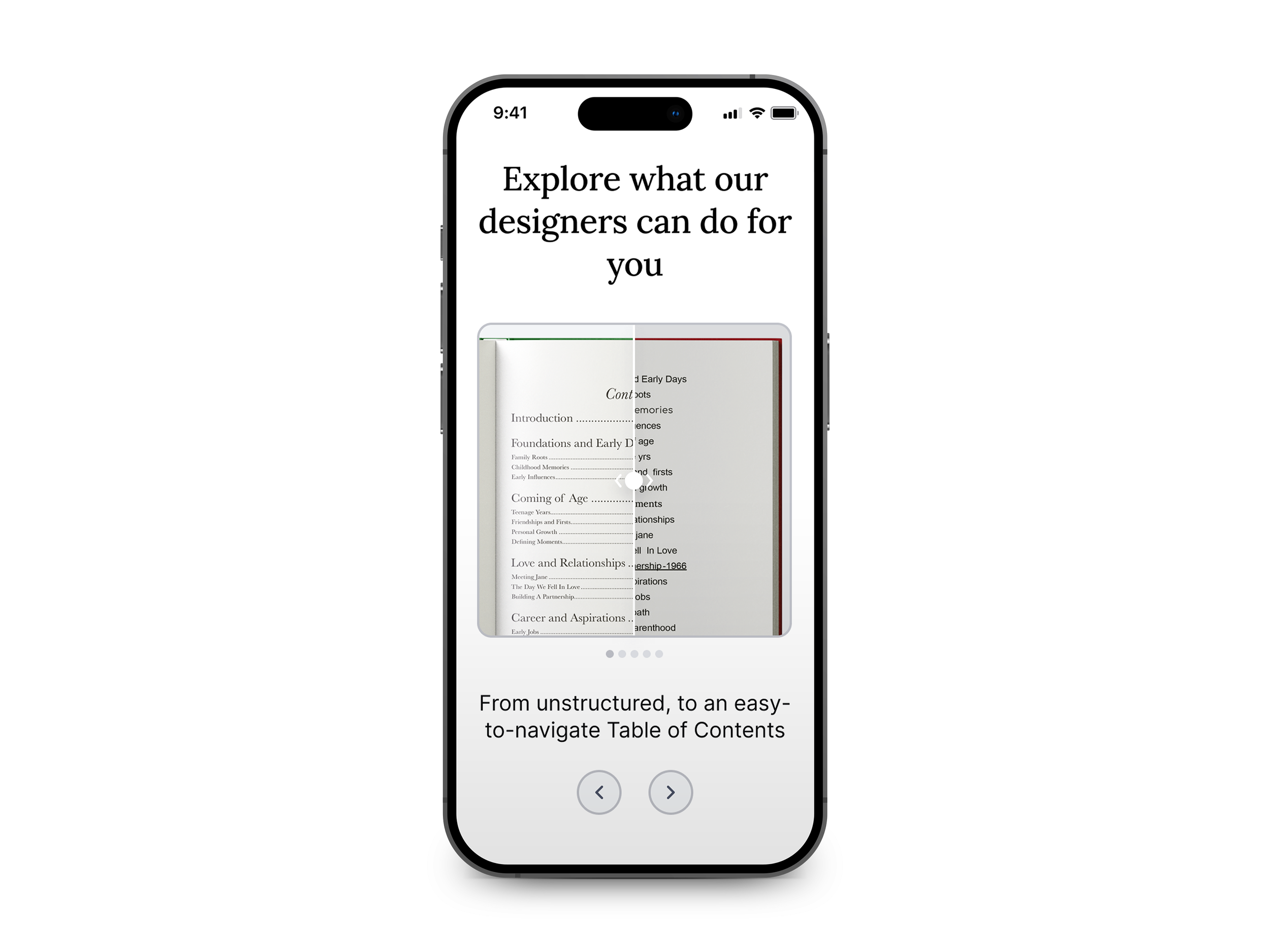
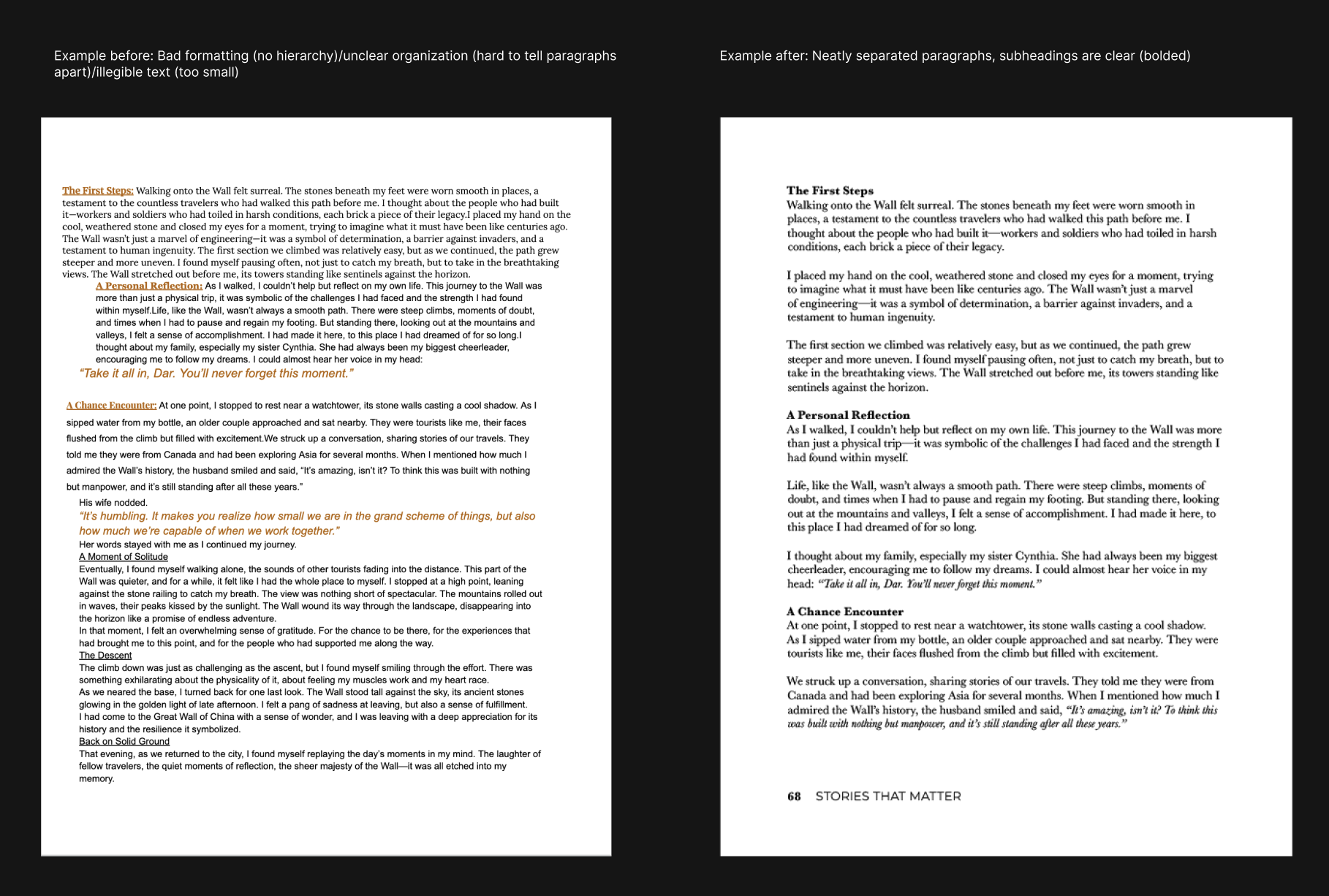
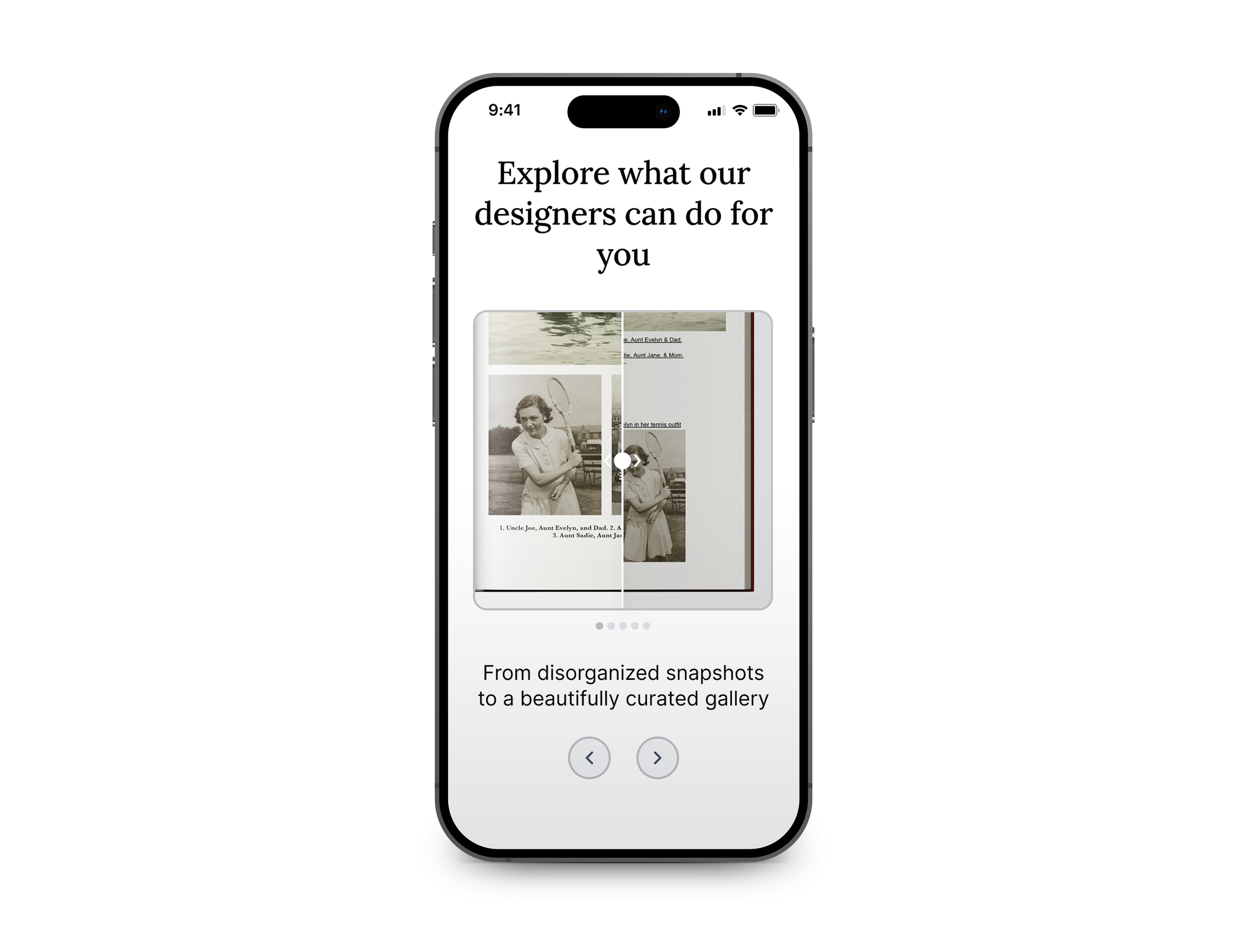
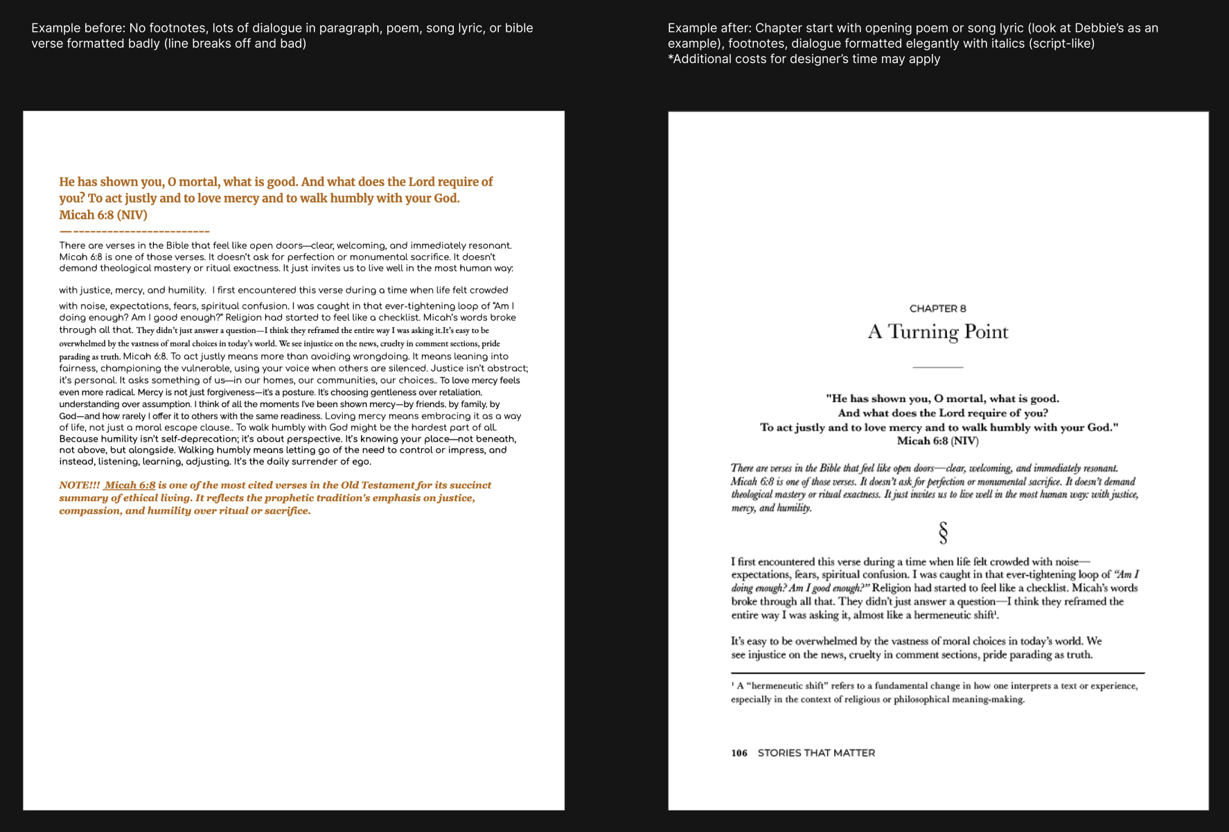
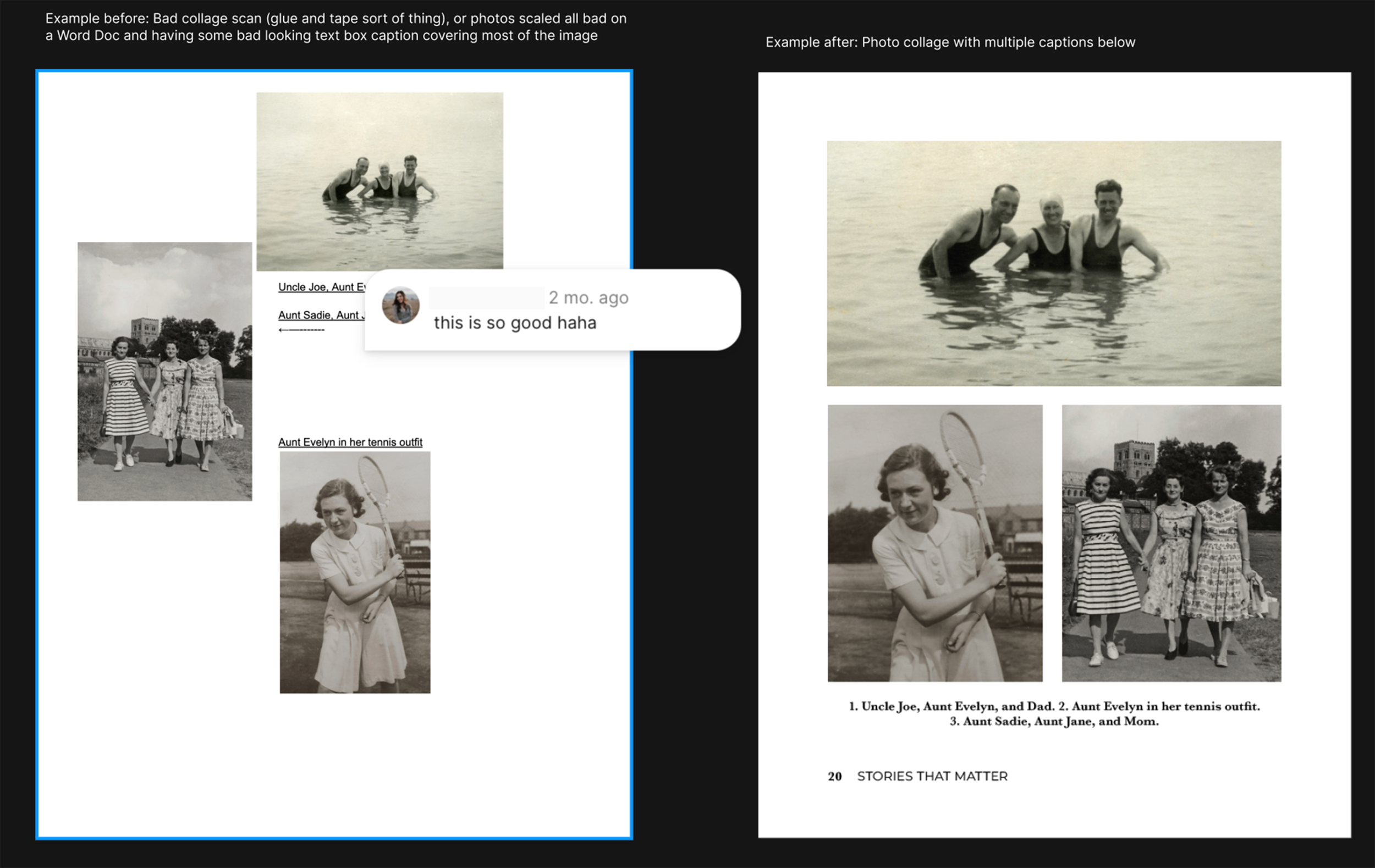
I was tasked with designing a Before & After section for one of the main landing pages. The goal was to clearly demonstrate the value My Stories Matter brings to each client’s story by showcasing how we elevate their content through thoughtful formatting, professional editing, proofreading, and photo enhancements.
Task
Design a section that visually demonstrates to My Stories Matter clients the improvements we make to elevate the quality of their memory books.
Process
When approaching this section, I asked myself—what’s the most effective way to highlight the value of our formatting and editorial services? A before-and-after comparison felt like the clearest and most impactful solution.
I began by wireframing the layout using our existing design system. From there, I created rough drafts of the “before” and “after” mock ups to be added to Figma for feedback from my design manager. After deciding on the final drafts I created the mock ups for each before and after asset.

Prototyping
Collaboration
What I learned
From this project I was able to further improve my skills of preparing a file for hand-off. I was also able to gain more experience in collaboration with cross-functional teams while improving my skills in Figma through prototyping, utilizing auto-layout, and creating components and variants.