MusicLink Foundation
UI + Visual identity design — Academic project
OVERVIEW
MusicLink Foundation is a nonprofit organization that connects students with music teachers and resources, but its original website made it hard for users to find key information, understand eligibility, or engage with programs. As part of a UX design course, I redesigned the site to create a clearer, more accessible, and more engaging experience for students, parents, and educators.
Problem: Users struggled to quickly find essential information, navigate program options, and take action, leading to confusion and abandoned visits.
UNDERSTANDING THE USERS
Although this project was academic, I approached it like a real UX engagement, starting with an audit and defining user groups to drive decisions.
User Groups:
Students:
Looking for programs they qualify for and how to apply.
Parents & Guardians:
Seeking clear eligibility and support options.
Educators / Donors:
Exploring how to get involved or contribute.
These groups informed content prioritization and navigation.

GOAL
To transform the MusicLink Foundation website into a user-centered experience that:
Improves clarity and findability of key content
Supports users in discovering programs and eligibility information
Feels friendly, accessible, and trustworthy
Works well on both desktop and mobile


REDESIGNED EXPERIENCE
I reduced cognitive load by:
Grouping content by audience (e.g., Students, Parents, Educators)
Prioritizing high-value actions (“Enroll a student” “Donate now”)
This makes it easier to access relevant information immediately.
CLEAR CONTENT ARCHITECTURE
I restructured page content using:
Scannable headings
Short, accessible language
Consistent calls to action
Example: Eligibility criteria moved to a dedicated section with a clean layout so users don’t have to read through pages to find what matters.
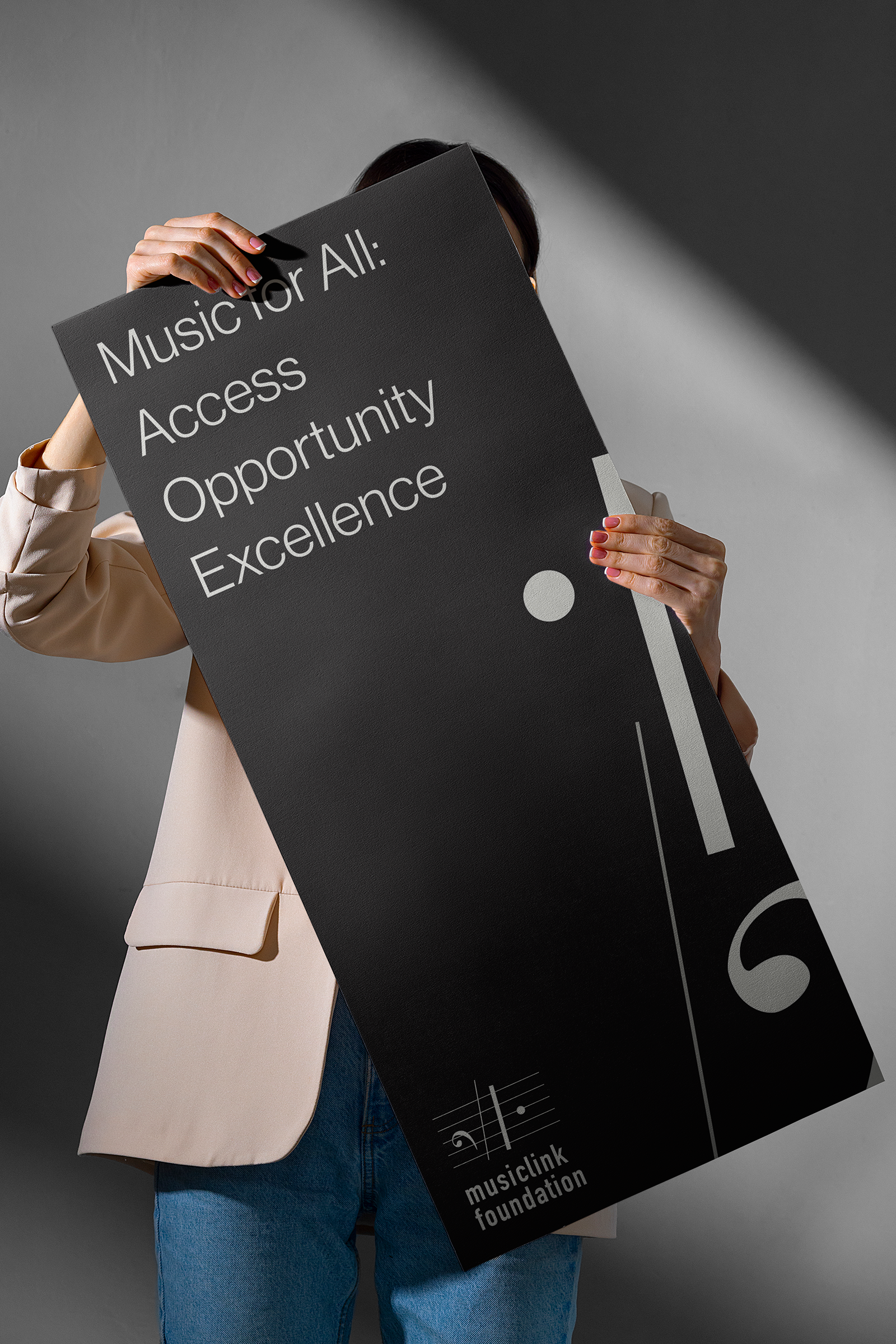
VISUAL DESIGN AND ACCESSIBILITY
IThe original site lacked visual hierarchy. I focused on:
Consistent type scale
Clear visual hierarchy for headlines, body, and CTAs
Accessible color contrast to support readability
Whitespace to reduce clutter
The result felt more inviting and easier to navigate without overwhelming users.
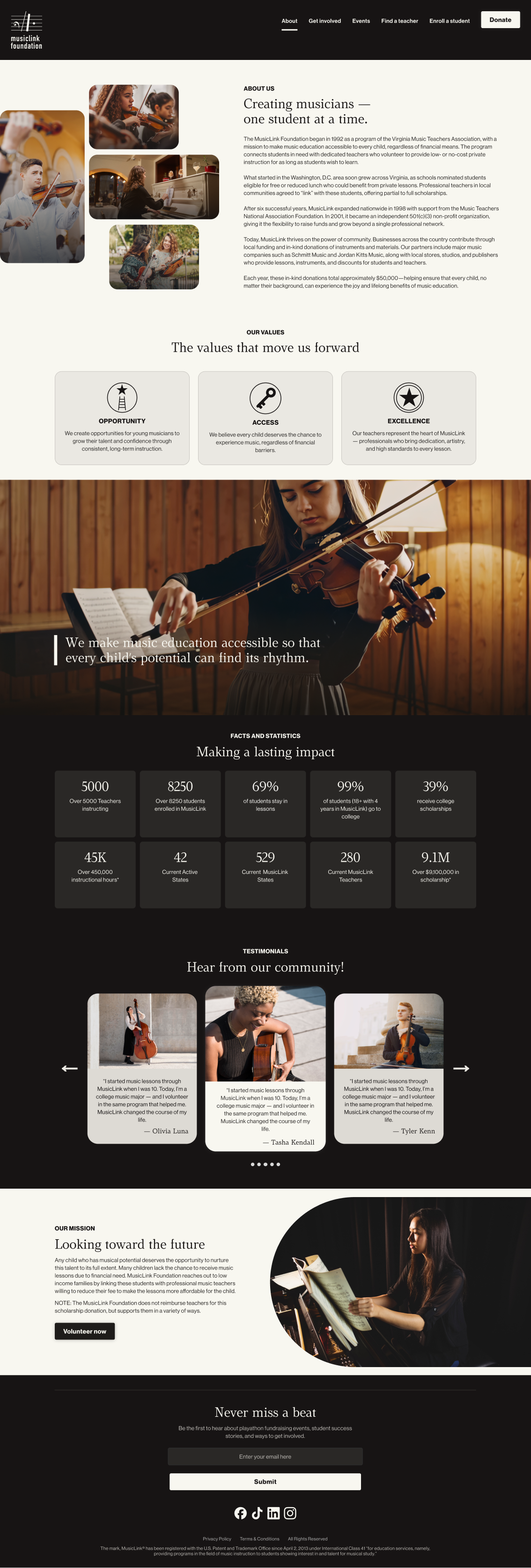
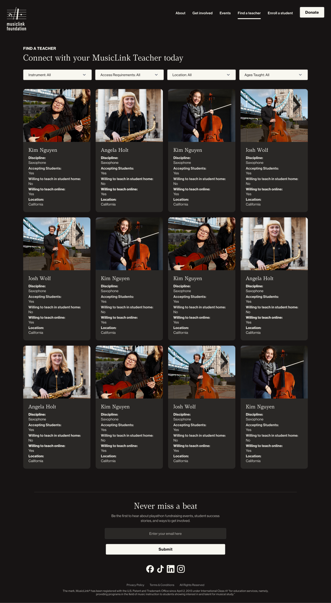
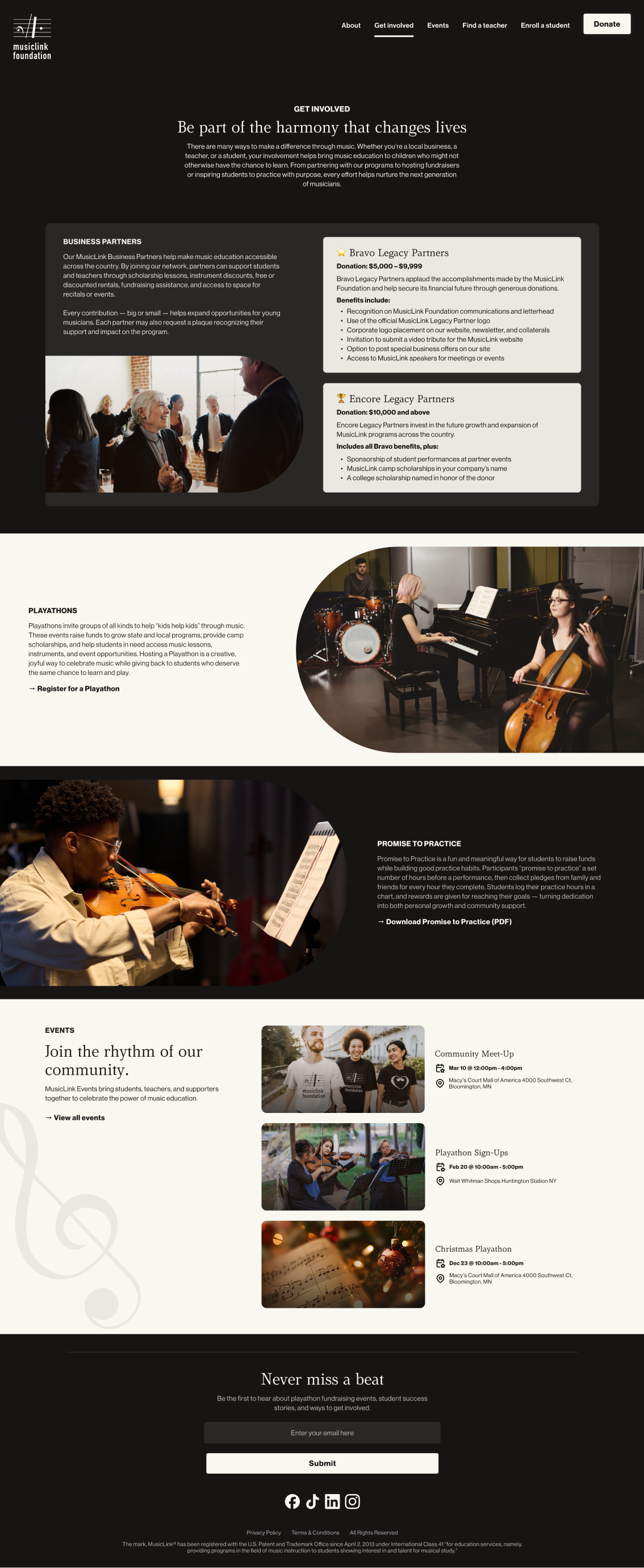
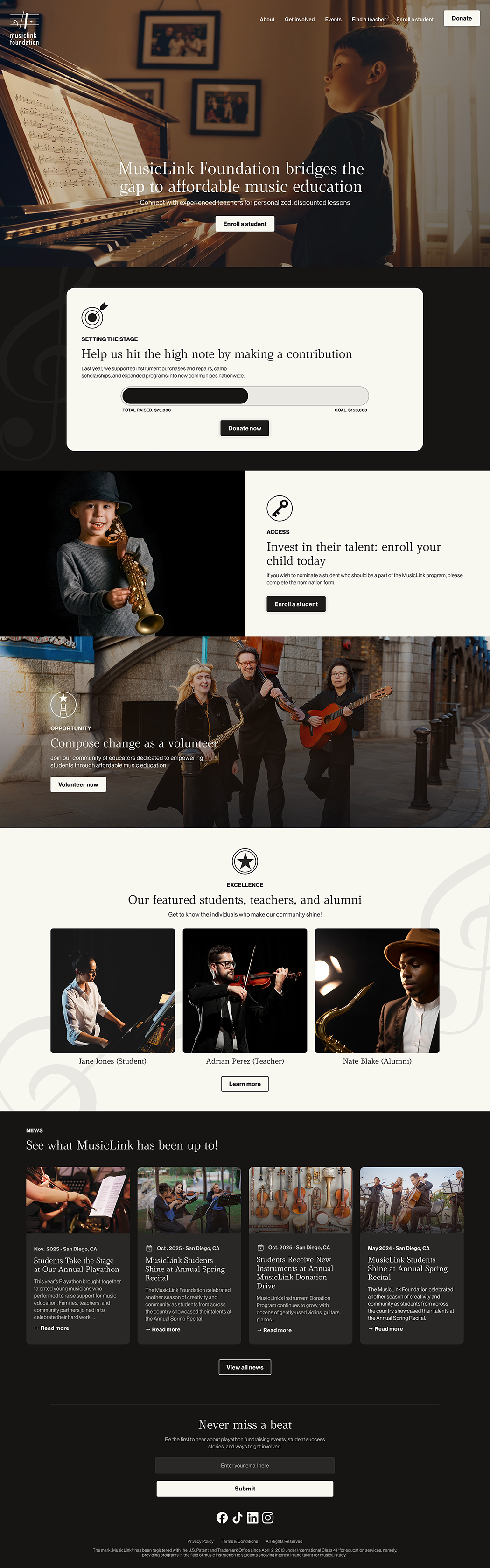
FINAL SCREENS & FLOW
Homepage
About
Get Involved
Find a teacher
Enroll a student
Donate
Each screen was designed to ensure users could complete core tasks with minimal friction.
IMPACT & WHAT I LEARNED
Even though this was a school assignment, I treated it like a real UX engagement:
I learned the value of content hierarchy for clarity
I experienced how audiences influence navigation decisions
I reinforced how visual systems affect perceived usability
If I had more time or real user feedback:
I would conduct usability tests with real users from each audience group
I would measure task completion time for key flows
I would refine content language based on user comprehension
REFLECTION
This project strengthened my abilities to:
Conduct UX audits and synthesize insights
Structure information for varied audiences
Create clear visual systems aligned to user goals
It reinforced that clarity and context always come before decoration.

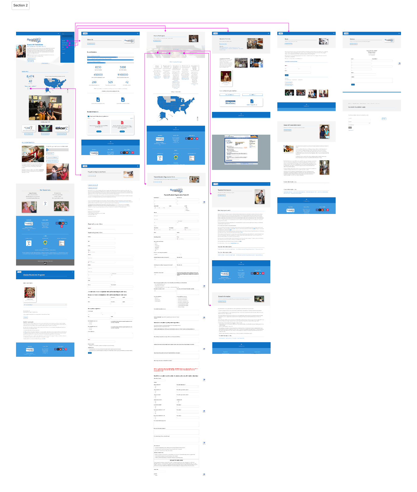
HEURISTIC & CONTENT AUDIT
I analyzed the original site for:
Content clarity
Navigation structure
Information hierarchy
Visual coherence
Accessibility signals
Key issues identified:
Main navigation was cluttered and unclear
Important content was buried in long pages
Calls to action were inconsistent or buried
Visual design lacked hierarchy and focus
This audit helped shape direction for improved structure.