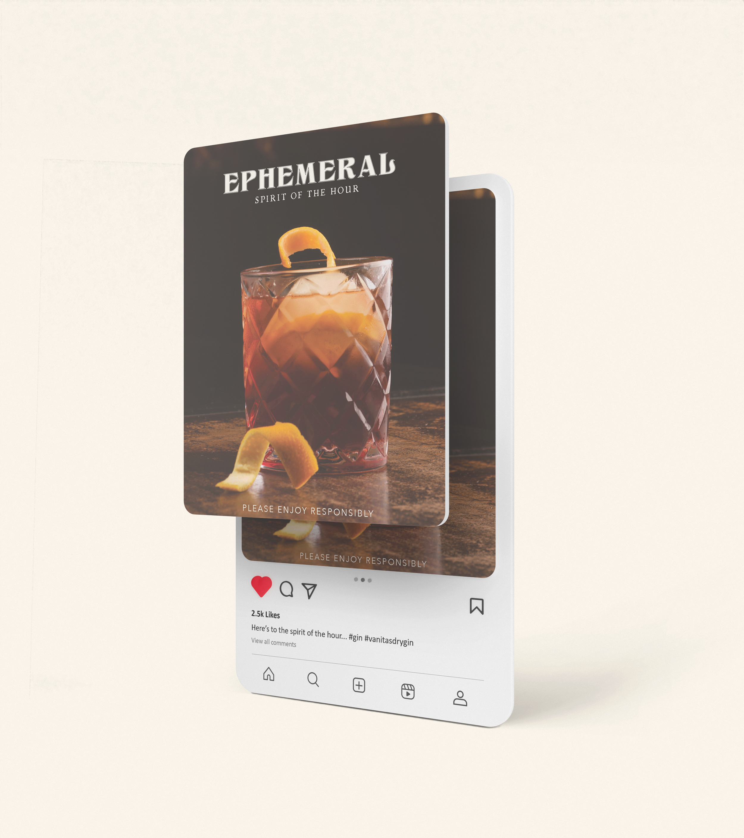
Ephemeral Gin
Packaging + label design

Overview
Produced in Germany, Ephemeral Gin is a concept Gin that pays homage to the profound symbolism of 17th-century Vanitas art. They are produced in small batches and handcrafted with freshly foraged botanicals coming from the Black Forest in Germany.
Mood

Color palette
The color palette employed draws inspiration from the rich hues of autumn, carefully chosen to evoke a moodiness reminiscent of the atmospheric depth found in Vanitas' paintings.
Typography
The typography selected for the logotype, named Klarissa Contour, was crafted by German Typographer, Dieter Steffmann, renowned for its frequent application in titles or headings. My choice of this typeface was motivated by its vintage aesthetic; its designer unbeknownst to me initially. Upon discovering the typographer's German origin, I found it to be an even more fitting complement for a Gin originating from Germany.
The other typefaces utilized were Brittany Signature for its handwritten style, Chapbook for its old-world charm, and Avenir for its legibility.
Solution
The solution is an amber bottle inspired by old apothecary medicinal bottles. Each label contains illustrations of the botanicals within and vanitas illustrations such as an hourglass, burnt-out candle, and a fallen chess piece amongst other items.